
We’ve logged our longer EV journeys for a year now. We wanted to get a feel for what a realistic range is like as the days grow warmer, and cooler.
When we started out, the measure that made sense to us was: how many miles do we travel per 1% of car battery?
You can picture the spreadsheet: start mileage, start charge; and then arrival mileage and charge. Subtract the numbers, do the division and … “miles travelled/percent used”.
Here’s how that looks, as mean miles per 1% over the year:
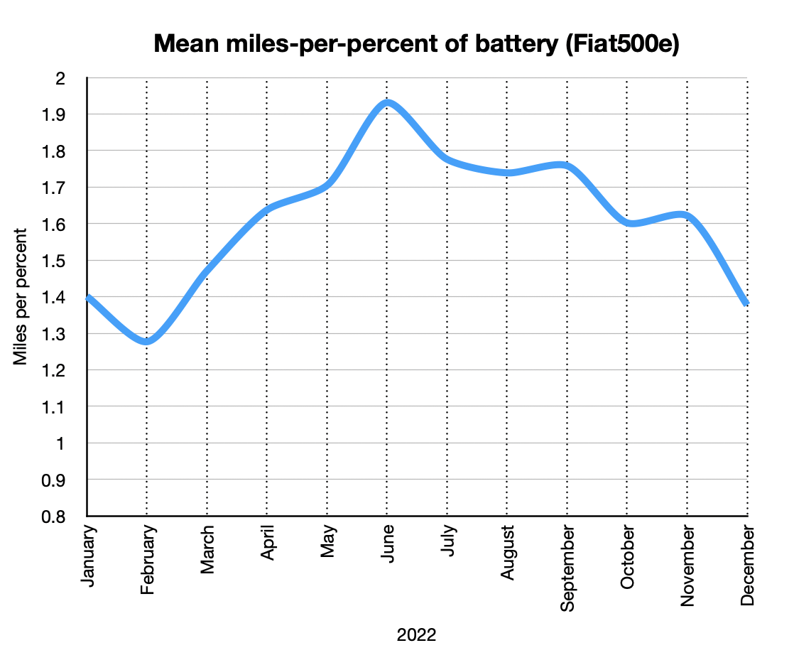
BTW: now, a year one, we’re comfortable with the more standard miles per kWh. And we know how to make the car report this. But, a rough conversation from miles/percent is to multiple the numbers on the graph by 3 to get miles/kWh.
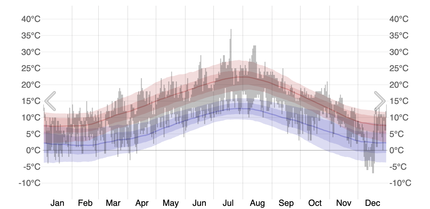
As expected, there’s a degree of relation to the change in temperature over the year:
The point of this was to know the variation of the range of our car. It helps plan longer journeys.